Selected work
Six projects told the way they were built: the problem, the decisions with their rationale and the solution, and, where it could be measured, the outcome.
SaaS · co-founder
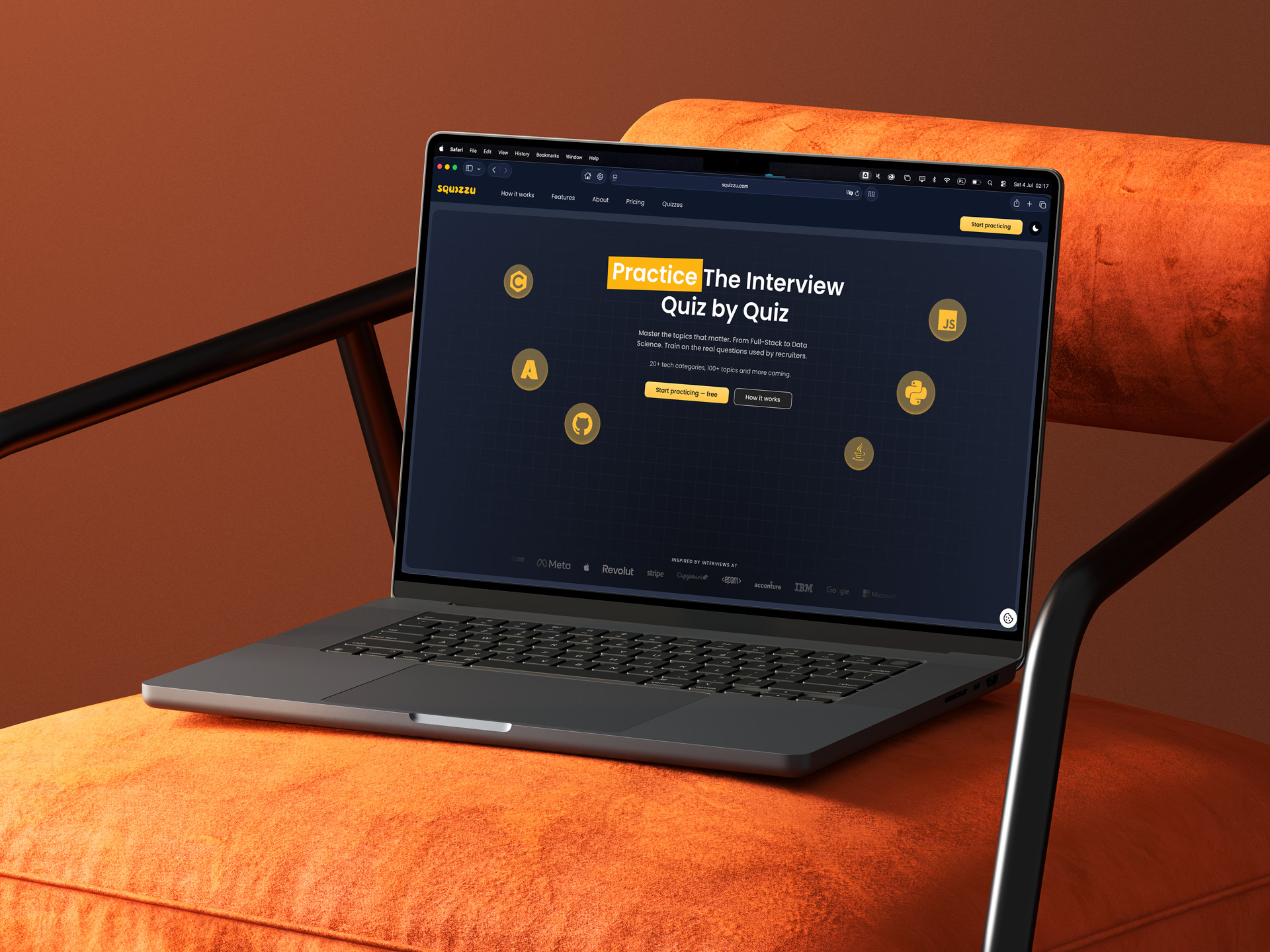
Squizzu
Preparing for technical interviews is a grind that's easy to abandon. Squizzu had to turn that grind into a game people come back to. The whole product, from user journeys to API contracts, had to be settled before the first line of code.
Read the case study
Branding + studio site
Ultra Studio
A studio's own brand is its hardest brief: it has to clear the exact bar we set for paying clients. Ultra Studio needed an identity and a site that were its best calling card, and a way of working where design ships live without losing control of the detail.
Read the case studyInternal tool
Venor
Ultra Studio needed a steady way to find and qualify the right companies to reach out to, and to trust that shortlist. The hard part isn't collecting names; it's producing a score you can actually explain, without pretending to know more than you do.
Read the case study
UX design + web development
Alumed
A premium aesthetic-medicine clinic needed a site that looks as exclusive as the practice itself, while loading instantly and staying easy for the team to edit. Those three pulls usually fight each other.
Read the case study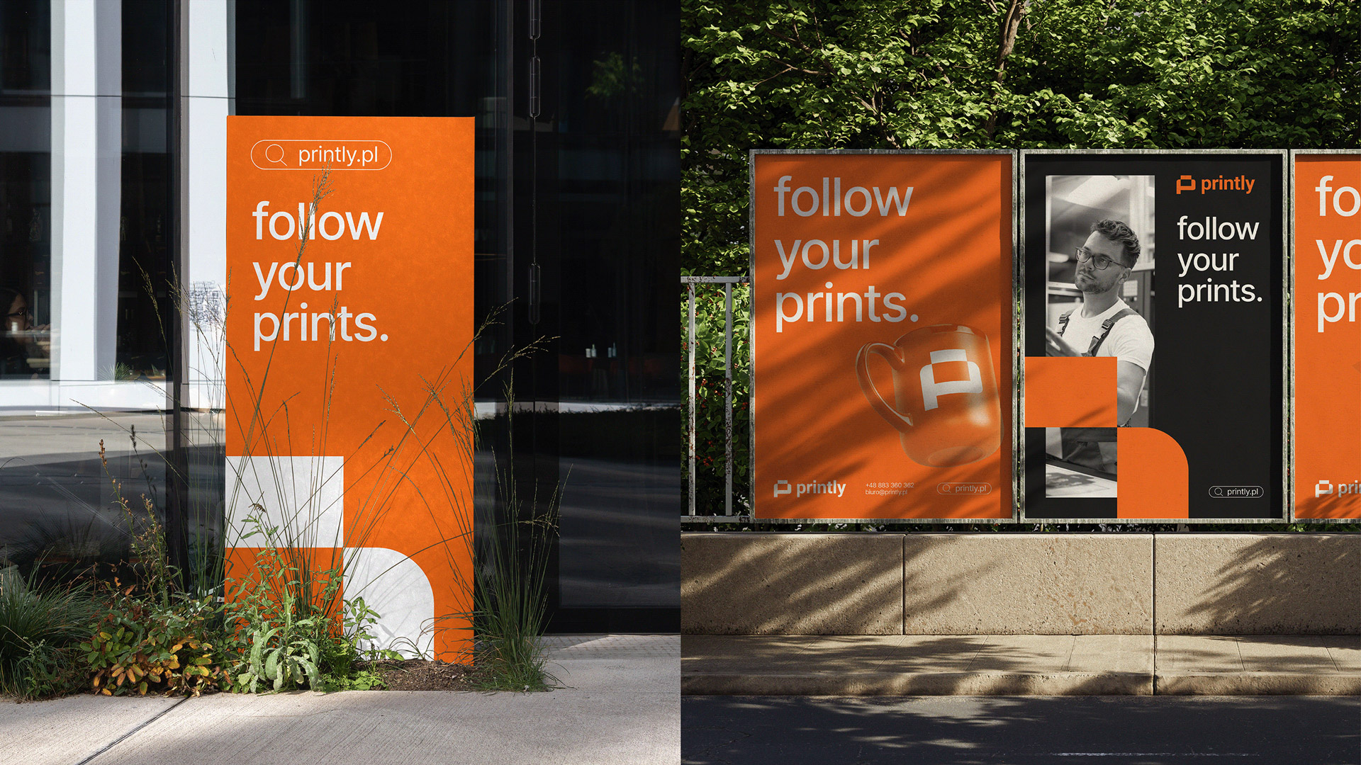
UX/UI + information architecture
Printly
A B2B print checkout means dozens of variables: formats, paper weights, finishes, volumes and quotes. Customers were getting lost before they finished an order.
Read the case study3D simulation · fleet optimization
Drone Simulation
Given a set of drone deliveries: what is the smallest fleet that can complete them safely within battery and payload limits, and how do you route it through 3D airspace without collisions?
Read the case study

How I work
I work at the seam between design and engineering, so the same decision holds from the first sketch to the shipped screen. These are the principles the projects here stand on.
Definition before pixels
Before I draw a screen, I settle the problem, the user journeys and the contracts between frontend and backend, so the shape of the product holds before anyone commits to it.
A system, not a set of screens
I build the design system from scratch (palette, components, icons) rather than lean on a template, because consistency and a recognisable identity are what make an interface feel like one product.
Desktop and mobile together
I design desktop and mobile as one flow, not one after the other, so the experience holds up wherever it's actually used instead of being retrofitted to the smaller screen.
Consistency kept honest automatically
Where I can, I let the build enforce the contract (generated clients and quality gates), so drift between design, frontend and API breaks a check, not a user's screen.
Explainable over magic
I favour a result someone can question over one they can only look at: a score, a ranking or a rule should be something I can explain, not a black box.
Honest about scope
I name the boundary of what a piece of work does and doesn't do, and I don't claim an outcome I didn't measure. A stated limit is more useful than an inflated one left hidden.