UX/UI + information architecture
Printly
- Role
- UX/UI and information architecture
- Period
- Apr 2024 · 7–8 weeks
The problem
A B2B print checkout means dozens of variables: formats, paper weights, finishes, volumes and quotes. Customers were getting lost before they finished an order.
Context & constraints
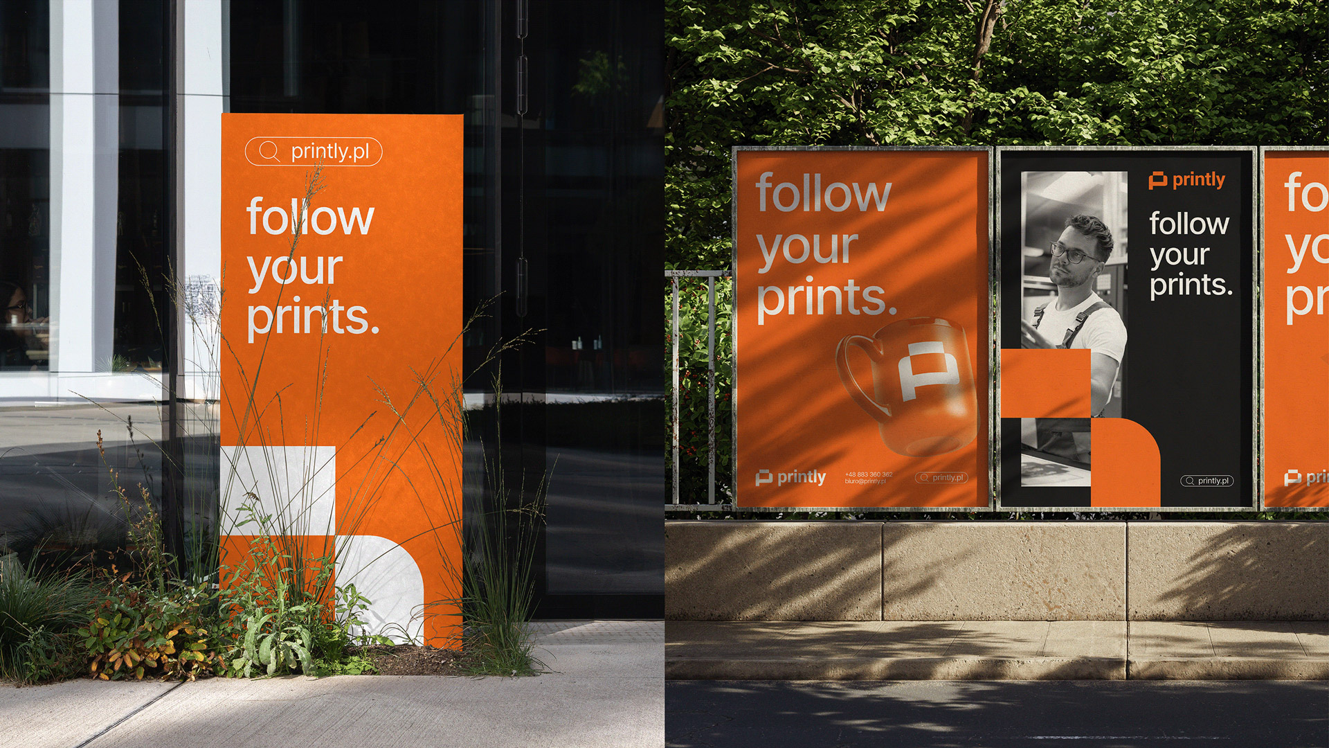
- Printly is a modern online printing house from Suwałki, rapidly becoming a leader in its industry.
- Scope: a visual identity, UI/UX design and a responsive site built around a simple order-placement process.
Architecture
I redesigned the information architecture from the ground up, so the catalogue and the order flow map to how a buyer actually specifies a print job.
Process
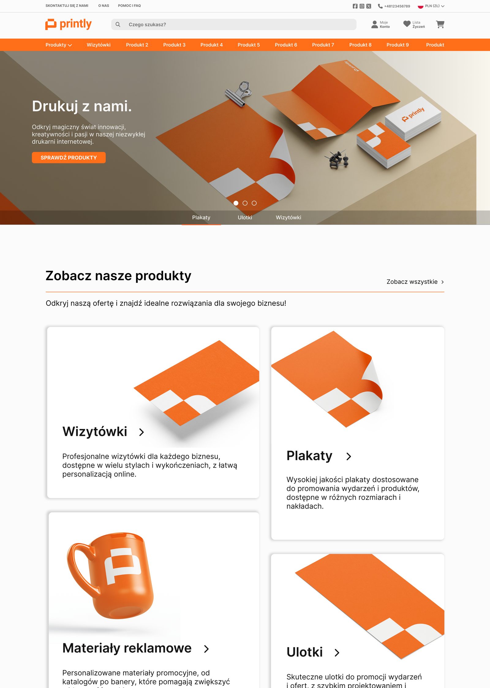
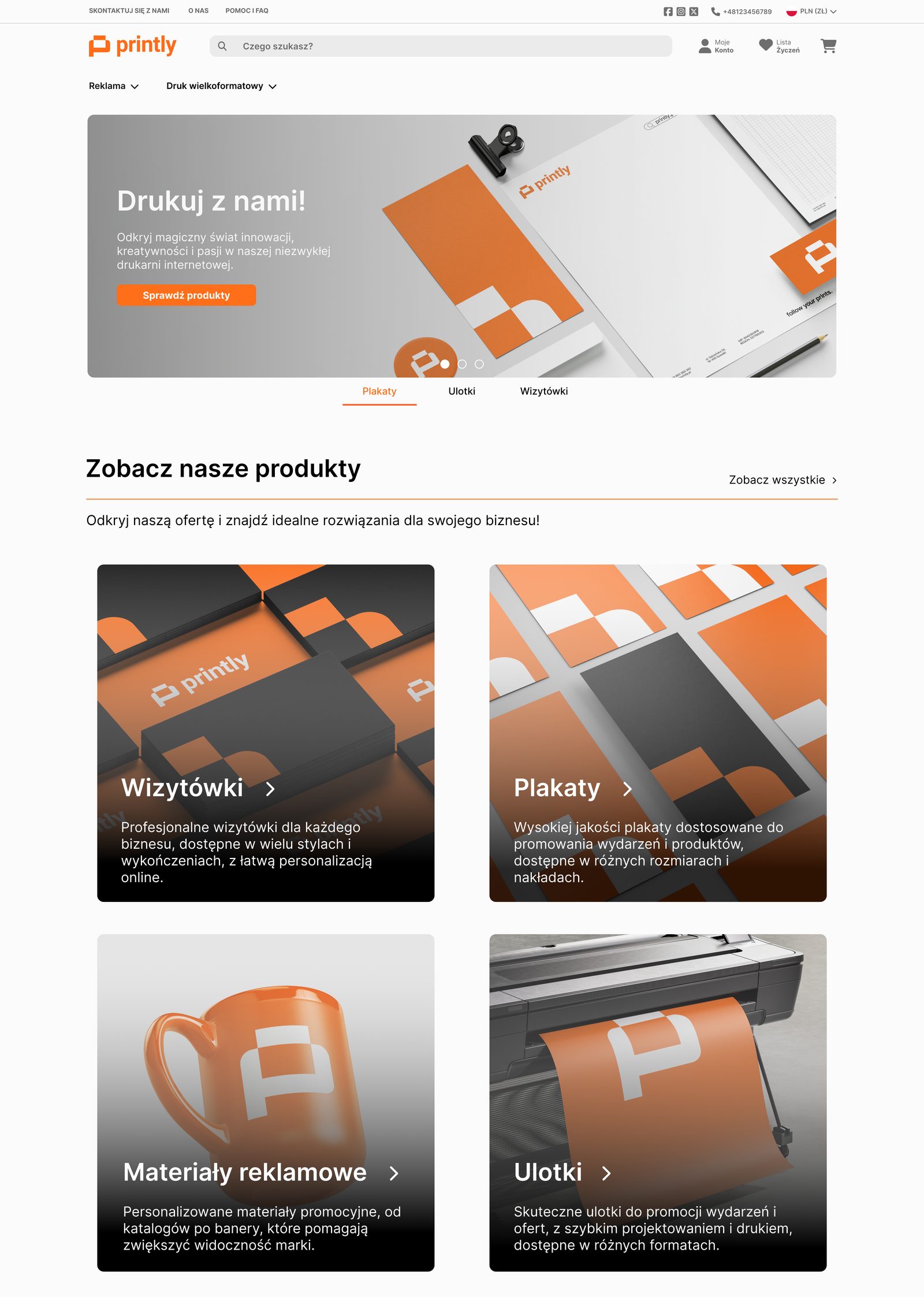
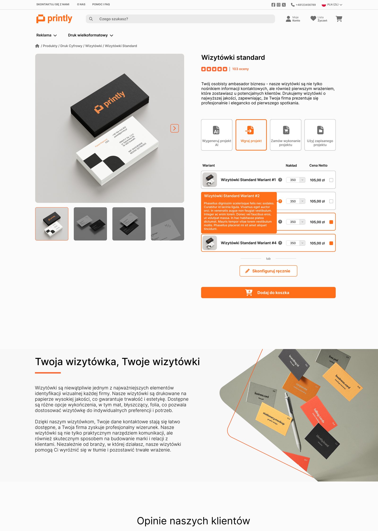
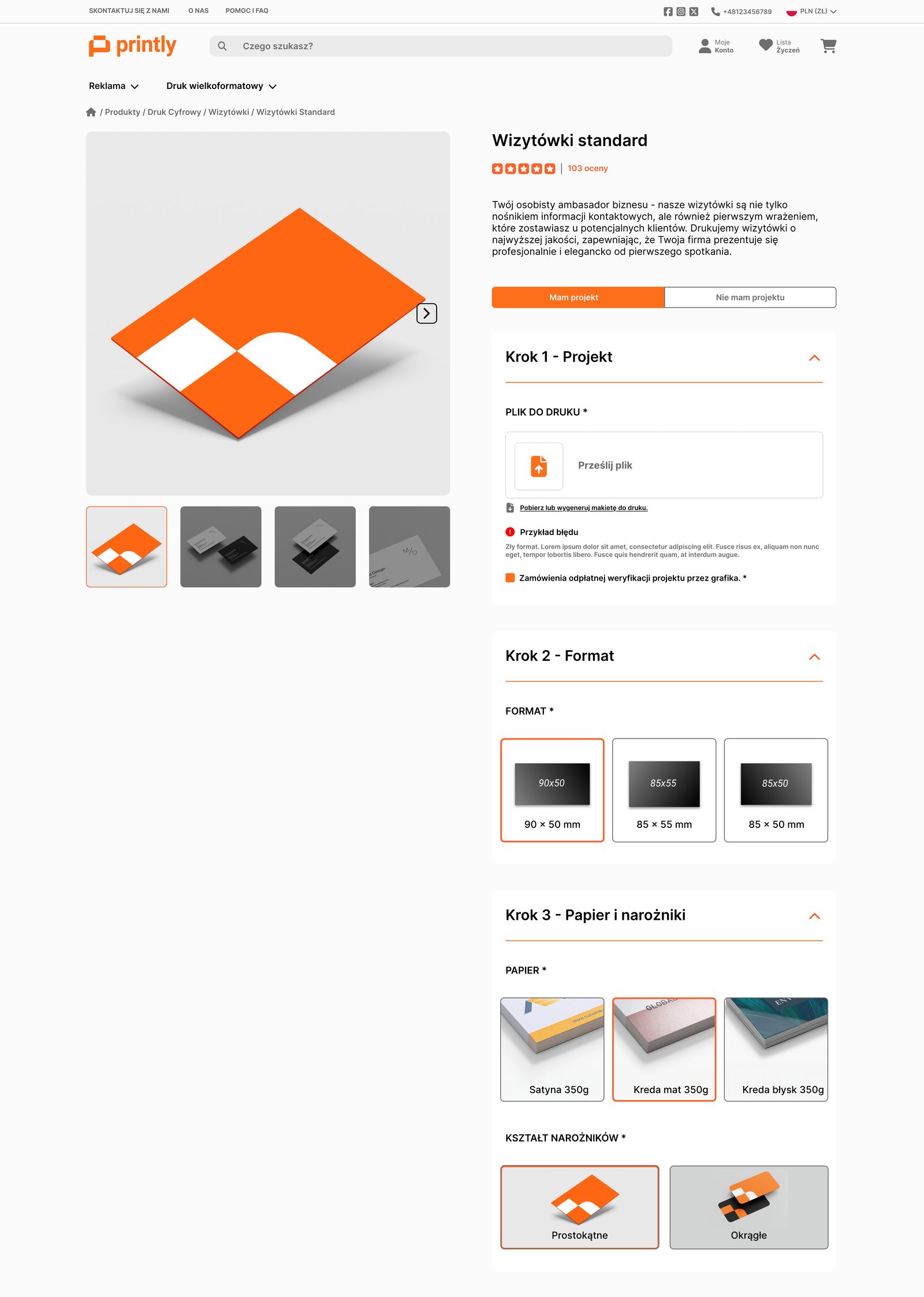
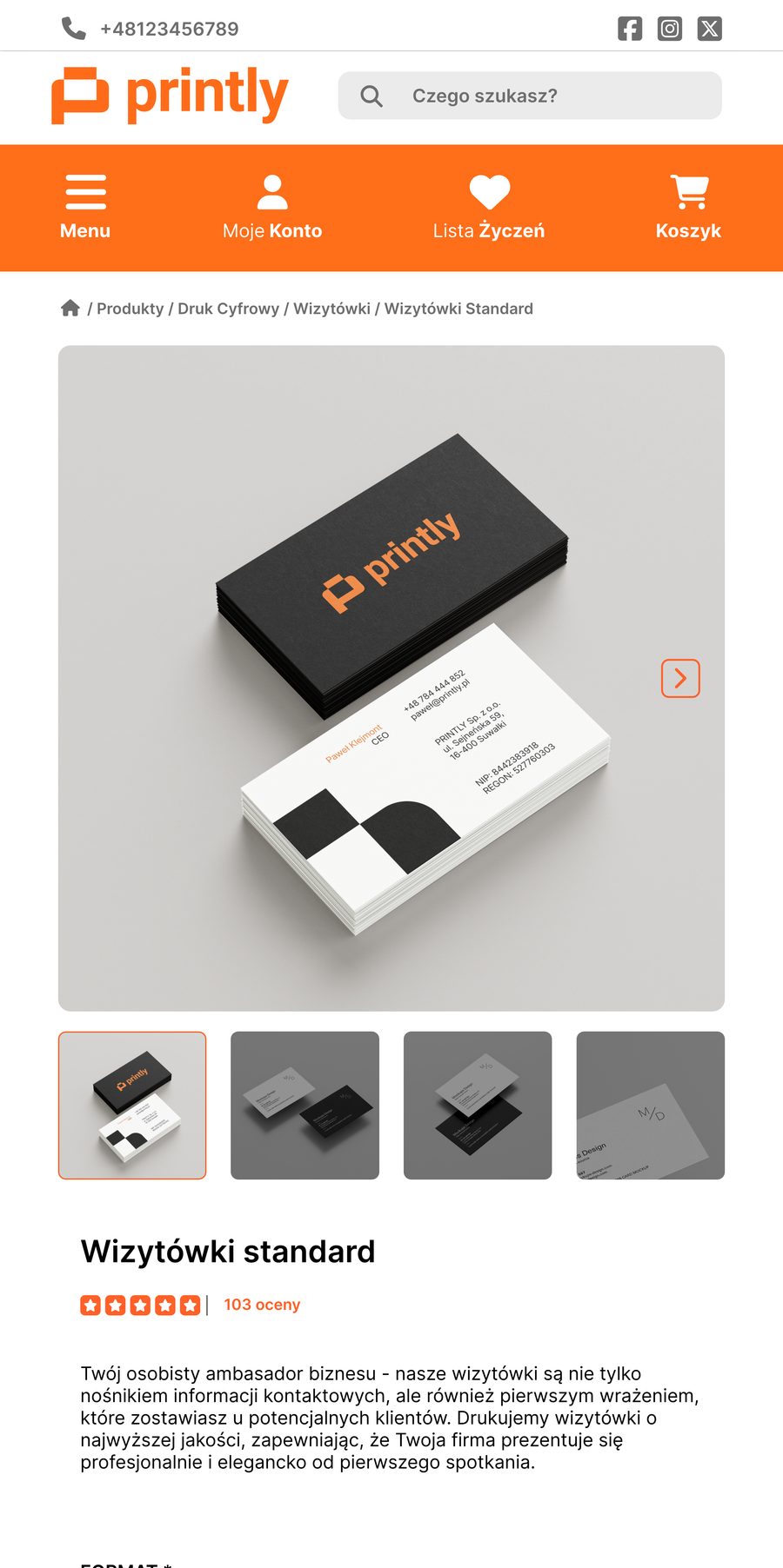
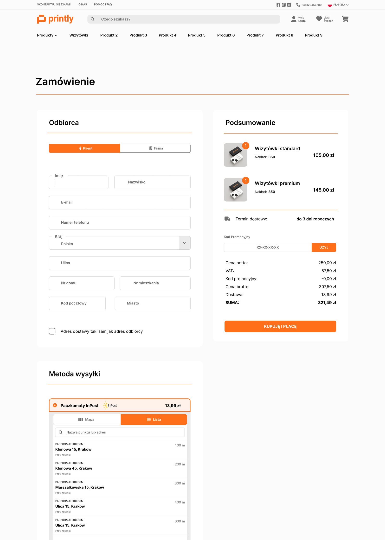
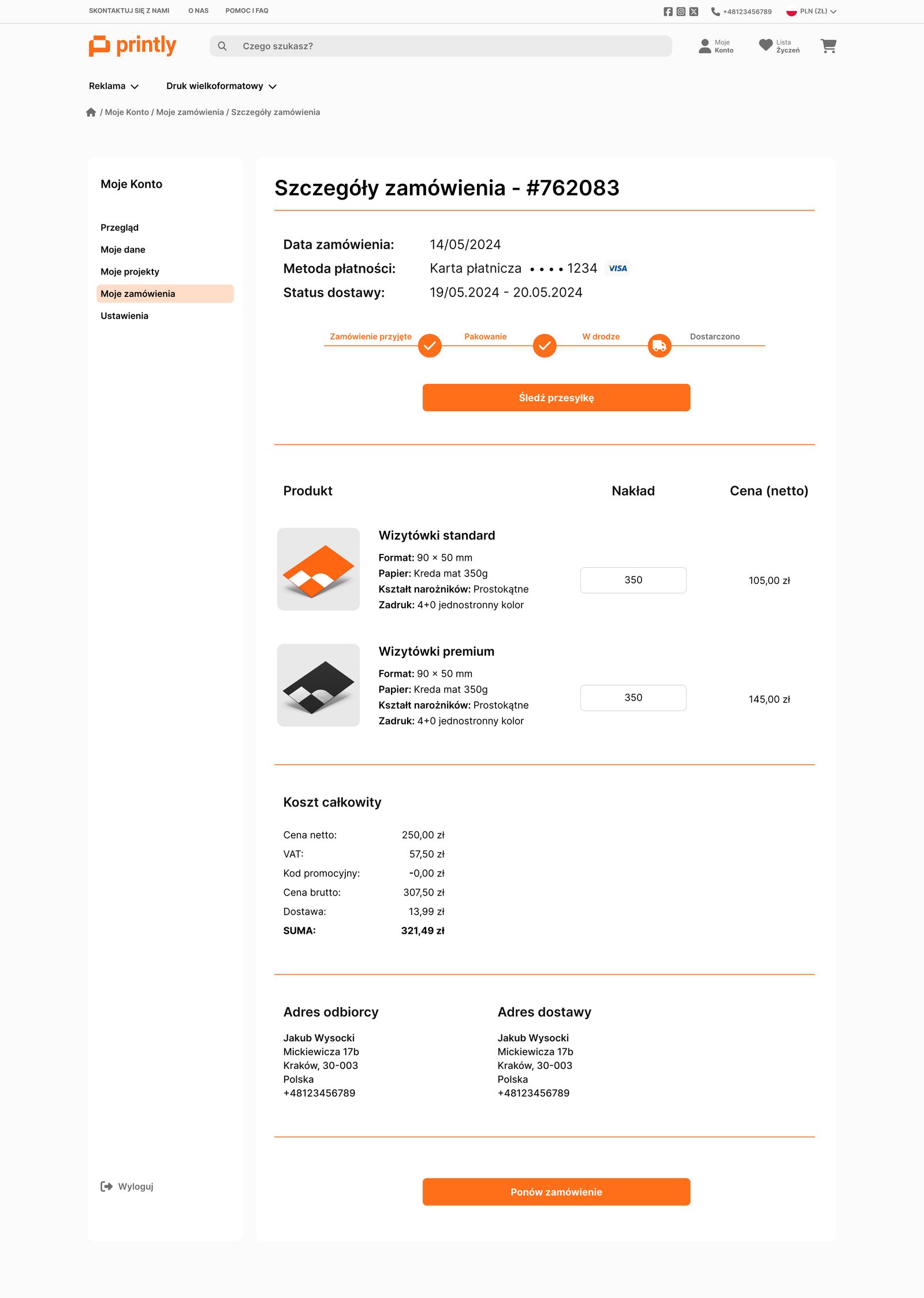
The work is documented across 17 Adobe XD artboards: two explored directions for the desktop homepage (v1 and v2), category and product views for desktop and mobile, a dedicated “I have a project” ordering variant, a megamenu, listing, cart and order screens, and a five-screen account area whose order detail carries a delivery-status stepper. An earlier backup file holds the previous generation, so the before-and-after is real.
Design decisions
- The information architecture rebuilt from the ground up.
- The catalogue's complexity was the problem; reorganising it was the fix, not decoration.
- A complex B2B checkout broken into an elegant, guided multi-step flow.
- Dozens of interacting variables overwhelm a single form; step by step leads the buyer without them getting lost.
- A dedicated “I have a project” path alongside browsing the catalogue.
- A buyer arriving with a ready file needs a different route than one still choosing a product.
- Desktop and mobile designed together, not one after the other.
- B2B print orders come from both; the flow had to hold up on a phone as well.
The solution
A brand-consistent, responsive site built around a simple, intuitive ordering process, delivered with a brandbook, source files, documentation and CMS access.
Reflection
The whole job came down to reducing complexity: not adding more options, but arranging the existing ones so the order almost places itself.