SaaS · co-founder
Squizzu
- Role
- Co-Founder & Full-Stack Engineer
- Period
- Jul 2024 - present
- Team
- Co-built with a backend team; I own the product design, the frontend and the design system.
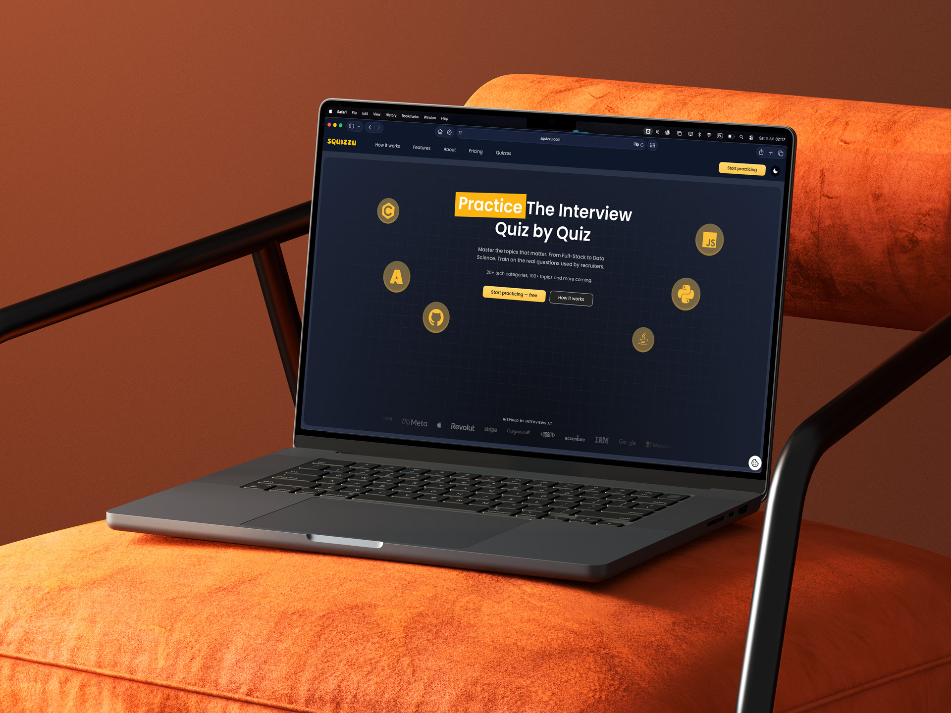
The problem
Preparing for technical interviews is a grind that's easy to abandon. Squizzu had to turn that grind into a game people come back to. The whole product, from user journeys to API contracts, had to be settled before the first line of code.
Context & constraints
- Greenfield: we started from zero users and an empty repository.
- One person owns product definition, brand, design system and frontend, with no pre-made UI kit.
Architecture
One OpenAPI contract binds the frontend and the backend: the client types are generated straight from it, so drift on the API side breaks the build before it can reach a user's screen.
Process
The design system wasn't borrowed, it was built in Adobe XD: a fixed palette (from warm ambers #FFCD5D and #FDB410 to near-blacks), a shared asset library, and a second-generation landing page drawn out in both light and dark. Over a hundred responsive screens and custom icons.
Iterations
I redrew the Explore quizzes view from the first low-fidelity wireframe to the shipped screen. Across six frames it moves from a flat grid of featured cards, through a guided three-step build-a-quiz wizard, to a single searchable directory of the whole technology taxonomy.
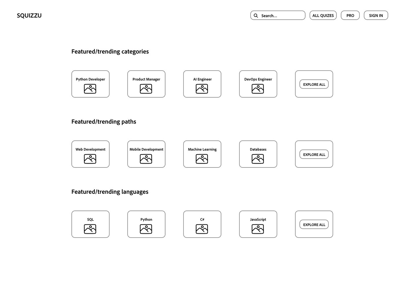
The first wireframe sets the idea in black and white: three stacked rows (categories, paths and languages), each a row of four featured cards plus an Explore all.
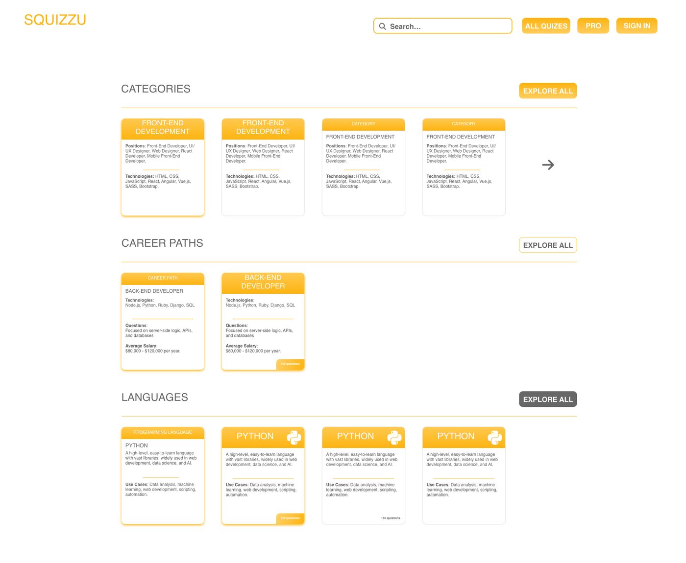
The yellow brand and real content arrive: positions, technologies, salary, questions and use cases, with a few card-header treatments tried on horizontally scrolling rows.
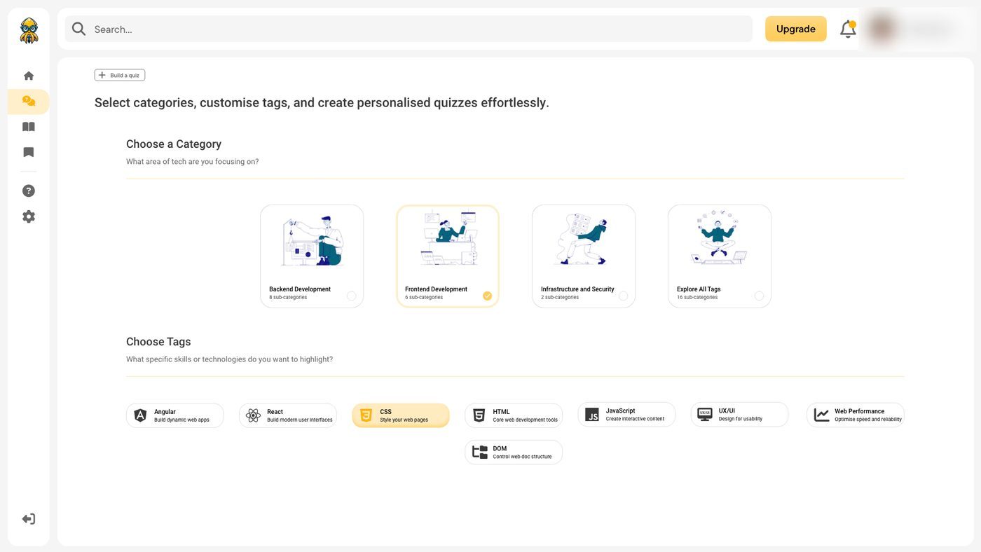
The view moves into the real app shell with a sidebar, and browsing turns into building a quiz: pick an illustrated category, then toggle technology tags.
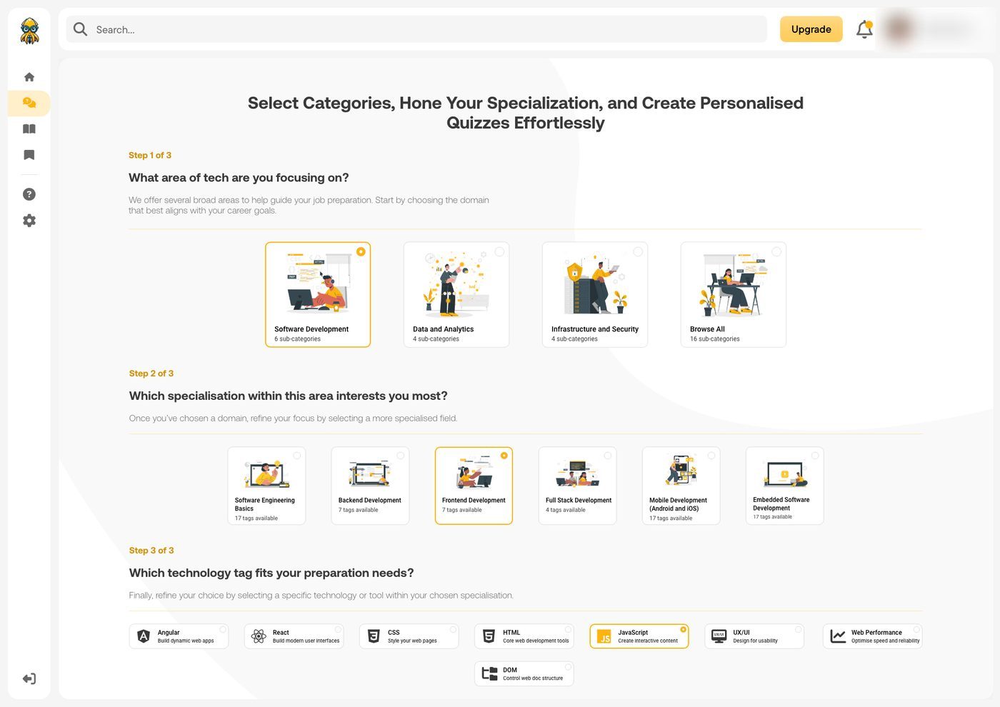
The flow made explicit: Steps 1, 2 and 3 on one page, with a helper line and consistent selection, so category, specialisation and tag read as three clear tiers.
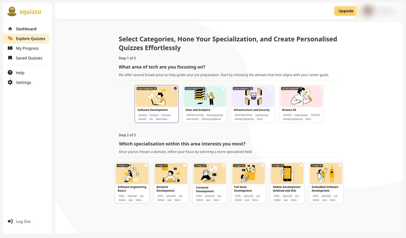
The sidebar gains readable labels and every card previews its contents: a count badge plus a strip of the sub-categories inside, so a choice shows what it holds before you commit.
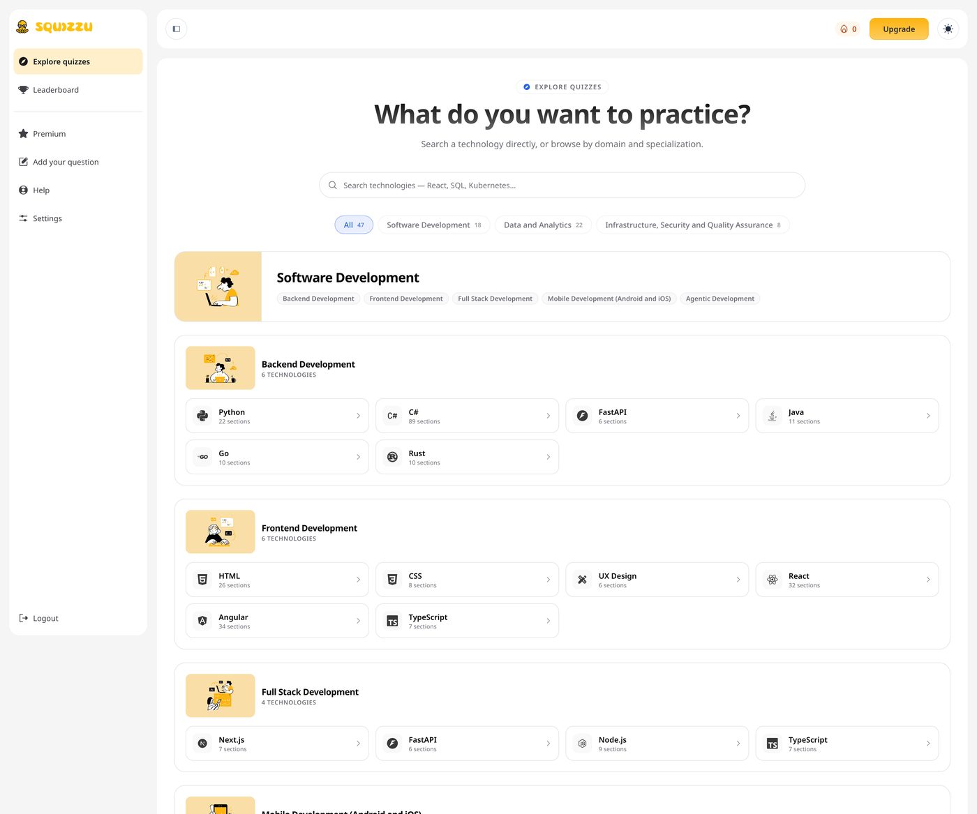
The shipped screen drops the linear wizard for one searchable directory: search and domain filters with counts above the full taxonomy, from domain through specialisation to technology.· final
Design decisions
- Definition before pixels: requirements, journeys and API contracts settled before building.
- A co-founder can't afford rework: the shape of the product had to hold before anyone built a screen.
- A design system from scratch, not a single pre-made template.
- A learning product lives on consistency and a recognisable identity; a template would have made it look like everyone else.
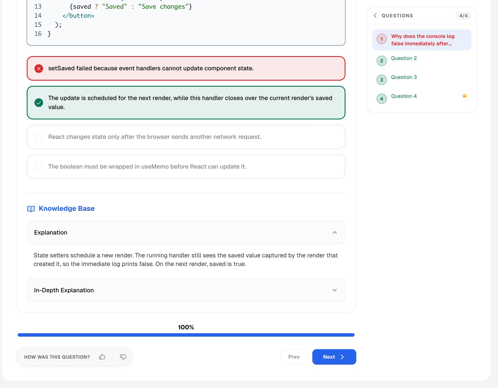
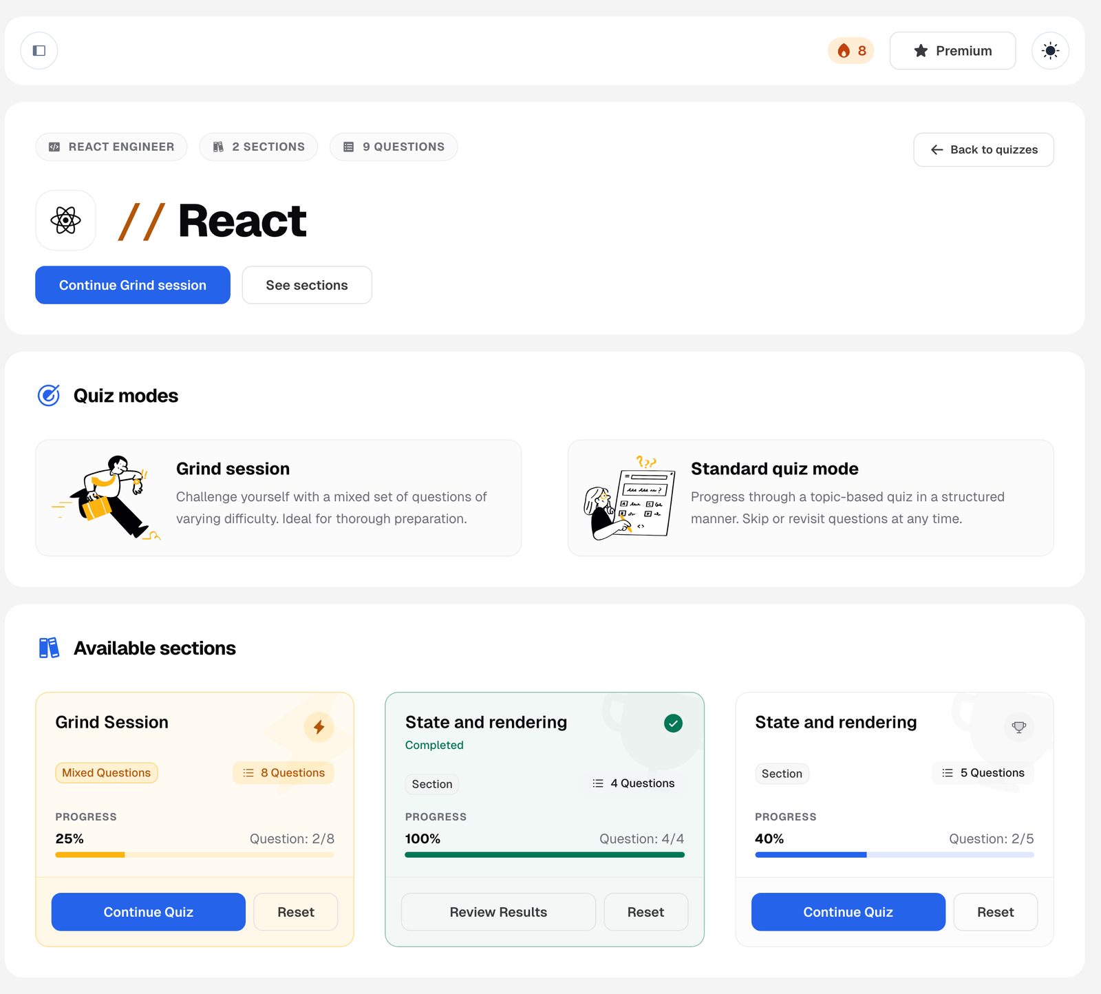
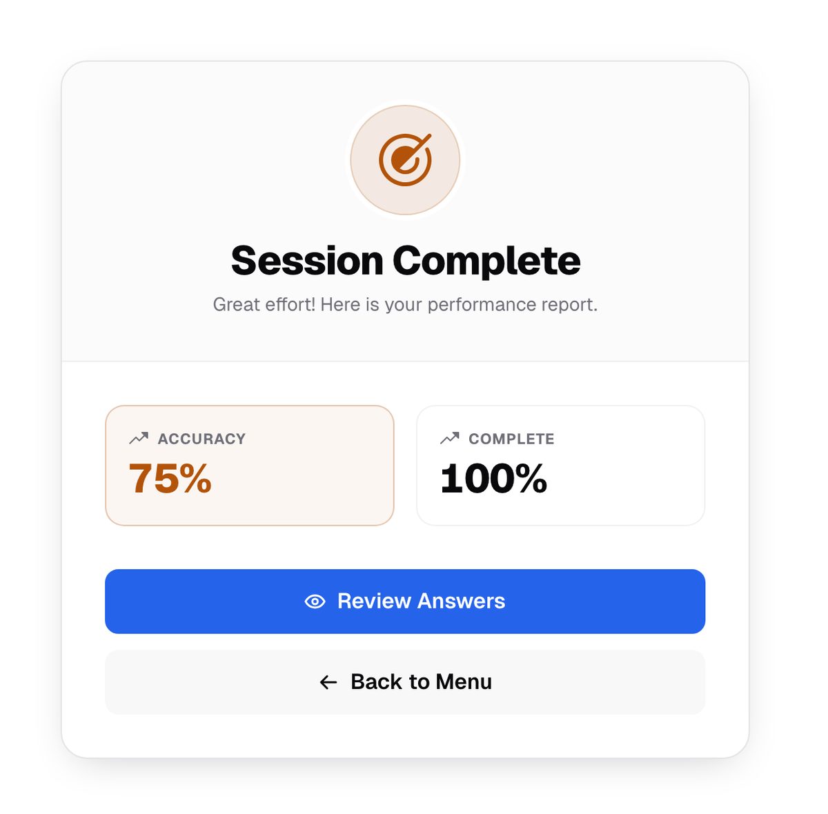
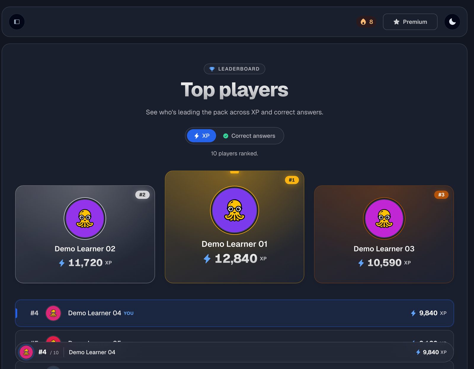
- Gamification as the core mechanic: XP and correct-answer rankings, streaks, progress tracking and several learning modes.
- Studying gets abandoned when it's dull. Game loops give a reason to come back the next day.
- Difficulty-graded practice, not a flat question bank: every quiz holds a fixed 25/50/25 split of easy, medium and hard.
- Interview prep pays off when it's structured; a graded mix keeps a session hard enough to matter without tipping into discouraging.
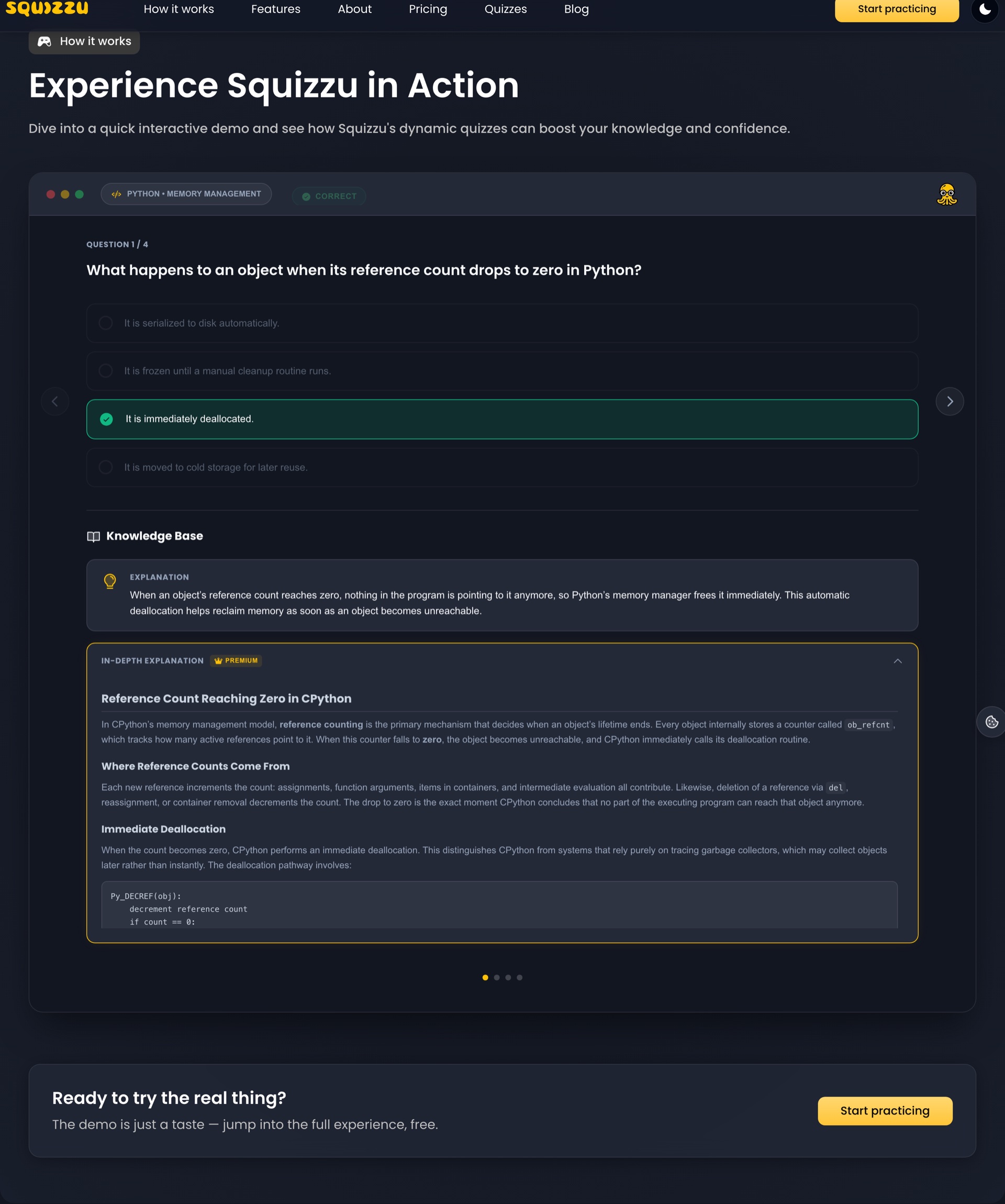
- The product demo lives on the landing page, with no login and no backend call: a self-contained, code-split demo that shares the app's visual language.
- The shortest path to conversion is letting someone feel the product, not read about it; when the demo looks like the real thing, 'try it' flows straight into 'sign up'.
- One visual system across two front-ends on different styling foundations: the app on owned, accessible component primitives, the marketing site on build-time atomic CSS. Both are driven by shared colour, type and spacing tokens.
- The two surfaces have to read as siblings without forcing one styling system on both; shared tokens keep the identity continuous from the first marketing page to the deepest product screen.
- Contracts kept honest automatically: TypeScript clients from OpenAPI, quality gates and self-healing validation of the JSON from GPT-4o agents.
- On a two-sided product, drift between the frontend and the API should break the build, not a user's screen.
- Content quality gated independently, to keep wrong questions from reaching users: every AI-drafted question passes a separate, cold self-critique pass, and a human publishes it.
- On a two-person team the guardrails have to run themselves: a second, independent judge on the content raises the floor before anyone's time is spent.
The solution
Delivered end to end: brand and design system, an accessible frontend in TypeScript, React 19 and Next.js with dark mode, on .NET 8 with Aspire orchestration and CosmosDB on Azure, topped with a gamification layer that turns studying into a game.

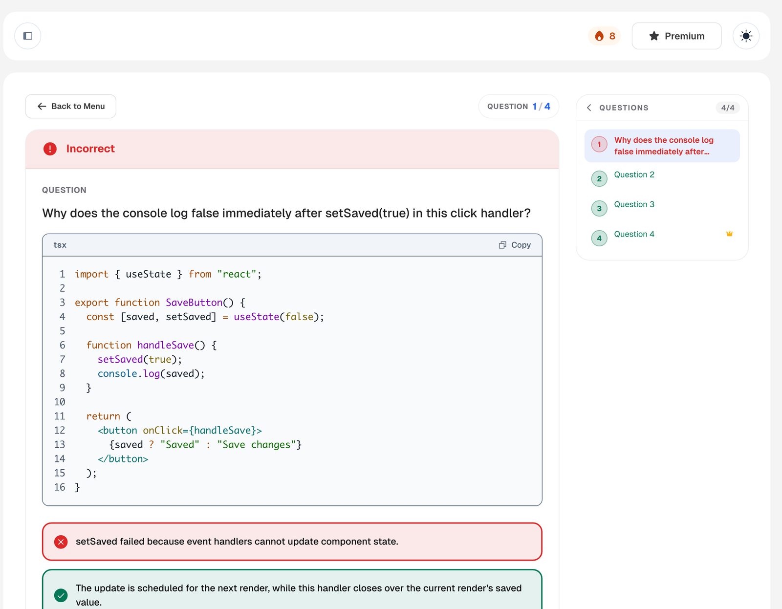
Outcome
On the gamification layer I designed and shipped, the platform grew from zero to over a thousand users. It runs in production as a paid product, not a prototype.
- users
- 0to1,000+
Reflection
Definition, brand and code in one head keep the seams between them invisible. The product feels coherent because nobody had to guess at someone else's intent. The rule underneath all of it: make the right thing easy and the wrong thing loud, in the design system, in the contracts, and in the quality gates.